[easy-tweet tweet=”This composition makes you wonder if you’ve just opened a portal to the plane where wildflowers are born. Its eyes grab you and pull you into an alternate dimension with springtime aromas where all the good and wild untamed or uncontrolled; living in a natural state and not domesticated things happen.” url=”https://wp.me/p6jrdc-ahs” template=”dark”]
How did I create it? ☞
What’s the big idea? ☞
What were the goals? ☞
What are my overall thoughts? ☞
Specs ☞
Order ☞
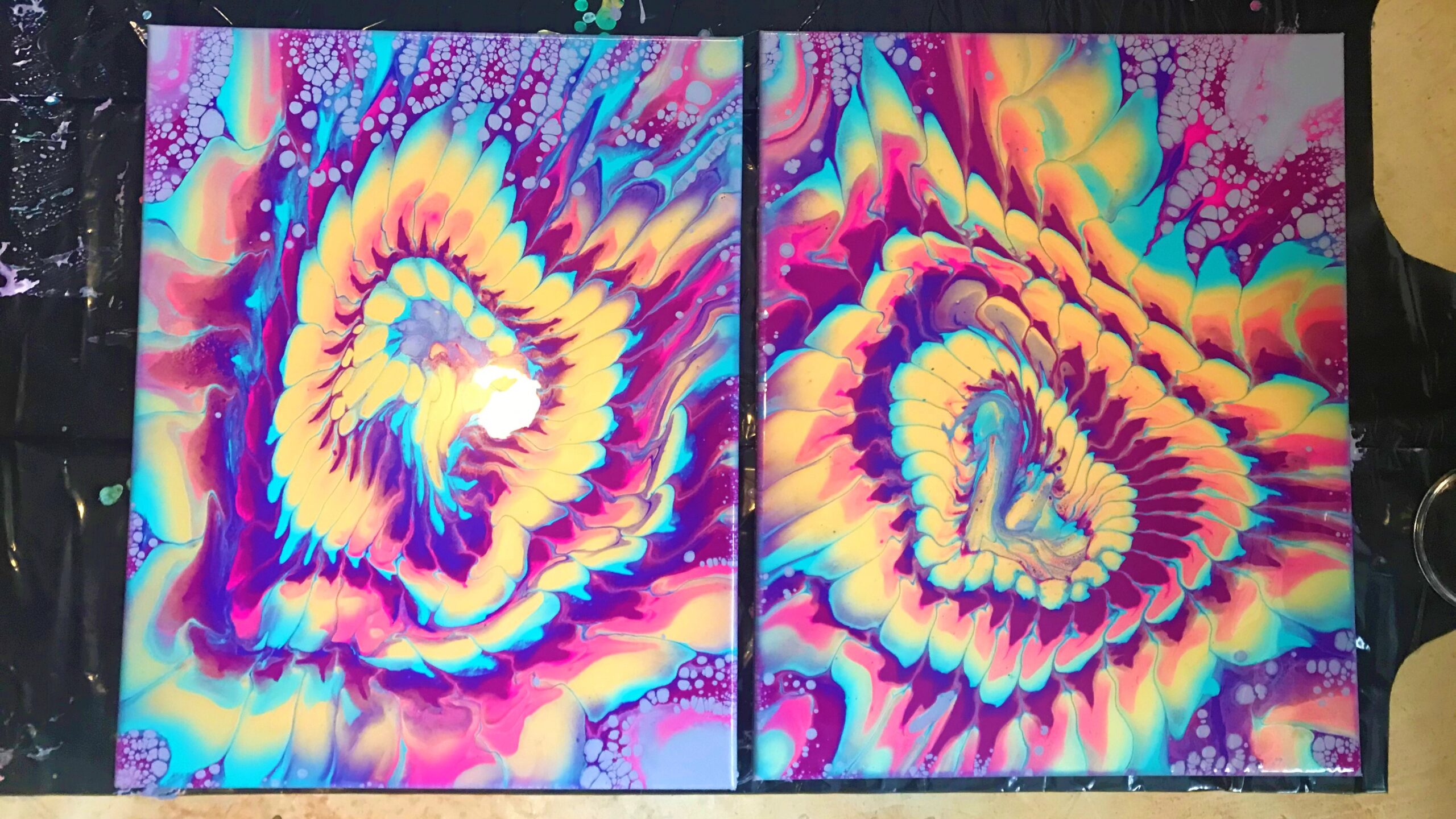
Fluid painting is the most fun way to create an artwork for display, to trigger our tactile senses with process experimentation, or to escape our digital siege. I am doing all three. The twin pieces are being varnished for re-homing and scanned at high resolution for prints and backgrounds for other sensory artworks from the studio. I’m working in series trying to find enchanting patterns with tools like strainers and divided funnels. I’m holding to a favorite color palette of gold—rouge—turquoise and looking for ways to move them forward and backward in depth to highlight figure-ground dualities.
The golden sheen is brilliant. It reflects any light in the room, but comes to full life in sunlight. When the room this amulet guards warms up, it releases a floral essence that magnetizes the space around it. This piece was made with care for creative high-energy places.
How did I create it?
I prep the surfaces of the level 1 canvases by spraying essential oil (violeta deep purple color, often used to evoke creativity, spirituality, or royalty, rose, wild bluebell, basil, dark tea, and musk) infused distilled water onto the back of the cotton duck. As the water dries, the fibers tighten to be able to hold the weight of the paints about to be poured over them. I flip them onto the floor and use a rubber mallet to drive a wooden thumbnail into each corner of the frames. This is keeps them elevated from the pools of paint dripping over the edges as it dries over the next few days. I do a quick check with my spirit level to make sure there won’t be any tilt during the drying process. After a little fiddling, the canvases are flush horizontal and in agreement with all known forces of gravity. They take a trip to the pouring table to wait for their paint bath.
I grab my dirty not-really-black-anymore apron and sit down at my altar to sanity, the mixing table.
I blend artist-quality soft body acrylic paint colors with a pouring medium, floetrol, to help them flow smoothly and level out evenly as they spread. I also add splashes of alcohol to reduce air bubbles. Distilled water joins the party to thin the blends to the consistency of warm honey. I stir each for a few minutes with craft sticks and let them settle in their pouring containers overnight to get rid of more air bubbles. The gold is a thick body paint and needs more thinning than the other blends, but I let it keep a slightly sturdier consistency against the others. It has a massive amount of sparkle. The mixing ratio is about
1.0 part acrylic paint : 1.5 parts pouring medium : 0.5 part water
I build a custom pillow paint with enamel additive to create the outer cells effect. I scoop it onto the canvas with a ladle and spread it over the gessoed cotton with a large paint mixing stick. My trusty gloved fingers ensure all the edges and corners are covered. The pillow layer helps the color blends flow together more evenly when they are tilted out.
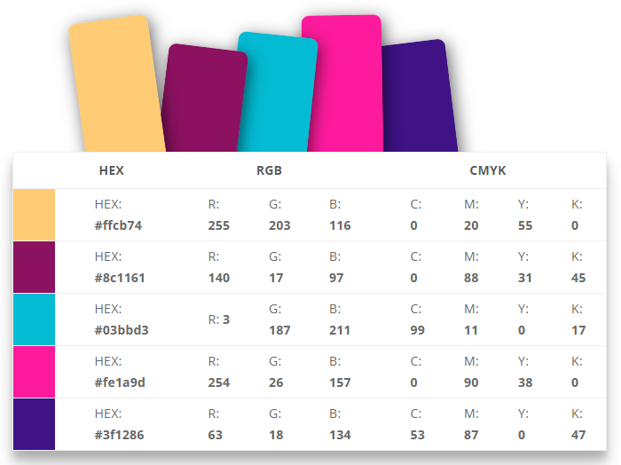
Color choices are instinctual – I mean, is there really any other way? I lean toward a triadic scheme of three hues spaced evenly on the color wheel. This lets the colors stay vivid and harmonized as they hop around the canvas. This painting uses cool colors, with the exception of the gold, to relax the busy lines created by the strainer pour: violet-red (rouge), green-blue (turquoise), and orange-yellow (metallic gold). Analogous accent colors are added for depth and richness.
The colors are tertiary and vividly opaque, but not as bright as primary or secondary colors. These are natural-looking tones. They serve the artistic intentions of the painting.
This painting is being created in late summer, so I don’t need to warm the paint. It is already at a nice room temperature and flowing smoothly. The colors are patiently layered straight into a small strainer to create the flower pattern. They flow through the slots and spread slowly into the pillow paint.
The patterns open as I tilt the canvases. I am careful to stop before the lines start to fall apart and become jagged. The weight of the paint blends keep the colors from mixing too much. They stay vibrant and do not muddy. After the pattern arrangement is settled, I use a torch to pop any residual air bubbles and help the gold sink in some areas. To seal up the painting, I give it a blessing and let it to dry.
With this plane,
Protection I lay
To ward this place
Both night and day.
Only good may enter here
So this I say.
What’s the big idea?
Acrylic pouring is really popular right now because people are looking for new ways to de-stress after long days of staring at computer screens, managing virtual meeting schedules, and the onslaught of anxiety that comes with the uncertainty that is the year 2020. Pouring is a process art that requires you to get your hands dirty and play with color and texture with the same curiosity you did as a five-year-old.
In the name of modern art therapy, I seek a natural direction with this painting to counter the relentless digital onslaught of virtual programming. I abstract a floral pattern using a color scheme fitting for naturalistic subjects. For weeks, the fancy tube of gold was whispering from the shelf, “Let’s pop in some sunshine for a smile.”
Turquoise makes an entrance to answer the call for hope, wisdom, and protection. Ancient cultures endowed these blessings onto loved ones and cherished places with the mineral. Modern descendants use turquoise to carry the same purpose.
Rouge is the foundation of this series. It explores the Natural Mystery with a subtle power behind it. The tone cradles the other colors and allows for vibrant harmony![]() a combination of different sounds or elements that blend well together : FOUND IN : Land of the Moon - GLOSSARY CARDS across the whole canvas.
a combination of different sounds or elements that blend well together : FOUND IN : Land of the Moon - GLOSSARY CARDS across the whole canvas.
What were the goals?
These paintings are an amulet. They will gift vitality and protection over its new home. They work together to amplify wild creative energy, leaving room for only good things.
The twin panels make the piece portable, but also allow each of the two flowers to tilt and spread independently. This gives the composition two separate, but balanced, focal points. The effect is like looking into the eyes of a strange adjective / streynj / stranger / strangely / stranger / strangest unfamiliar as a result of being out of one's natural environment or not yet part of one's experience Isn't it strangeHow people can changeFrom strangers to friendsFriends in new living entity. Try it for ten minutes! You’ll probably start to dissociate. Time will linger
![]() to stay in a place longer than necessary : FOUND IN : Land of the Moon - GLOSSARY CARDS. The colors of the painting will start to shift. The sounds around you will distort.
to stay in a place longer than necessary : FOUND IN : Land of the Moon - GLOSSARY CARDS. The colors of the painting will start to shift. The sounds around you will distort.
I repeat the same color layering order and tilt directions on both canvases so the designs would maintain their relationship and work together as two hypnotic eyes. I commit the layering order to memory and to keep them similar.
The figure and star of this piece is the heavier gold blend. The warm color dominates the other cool color blends by sending them into the background. It’s heavier weight keep its form crisp, as the foreground shape should be.
What are my overall thoughts?
I love a strong feeling of affection and attachment towards someone or something the way the two flower patterns flow into one another when they are placed side-by-side on their long frames. The silver-grey cells peek through the corner with a hint of shimmer from the mica. It compliments the intense shimmer from the metallic gold, which the photos don’t really pick up, and keep it from taking over the whole painting.
The turquoise and ultramarine blue blends seemed too heavy to open cells and holds them to the edges. The cells like the rouge and pink blends.
The paintings work together well. The continuity of pattern makes the design pulsea rhythmic beating or vibrating, indicating energy, excitement, or vitality in and out and your eye moves smoothly around the composition.
I think I’ll enter the wild and crazy flower realm more often, thanks to this fun guy.
Check back soon! Updates will be added to this gallery as the paintings are processed, dried, cleaned, and varnished.


Specs
Status: processing
Title: “Flos Ferox Porta”
Number: 235-236 in a series of fluorescent strainer pours on silver
Citation: Rennie, Autumn. Flos Ferox Porta — No. 237-238. 2020,
acrylic on canvas, Chrysanthemum Stories — Sensory Art Studio, Lawrenceville, GA, US.
Dimensions: 0.75 in x 16.0 in x 20.0 in
Style: Abstract
Theme: Art and Art
Format: diptych
Medium: fluid acrylic on cotton duck canvas stretched over a level 1 (back-stapled) traditional wooden frame
Colors: iridescent gold, metallic bronze, ultramarine blue, turquoise, fluorescent pink, fluorescent violet, rouge, grey-magenta base (custom pillow)
Additives: floetrol, enamel, mica, 70% isopropyl alcohol, distilled water
Varnish: none
Packaging: MEDIUM Kraft Easy-Fold Artwork Mailer (2.0 in x 16.0 in x 20.0 in), tissue
Acquisition: available for sale in the Chrysanthemum Stories Shop when processing and varnishing is complete
Catch a livestream: Youtube,
IGTV, or Twitch
You may like this one too
Order a pretty picture
What did you think?

Discover more from Chrysanthemum Stories
Subscribe to get the latest posts sent to your email.