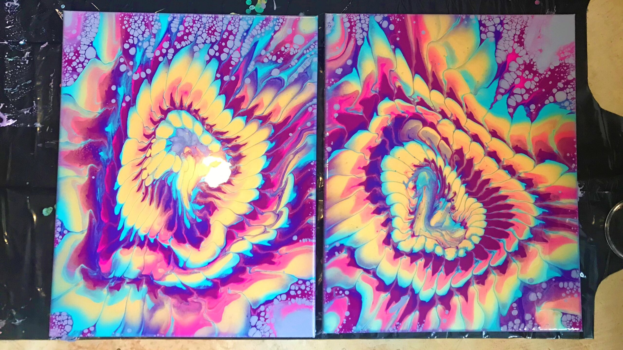
[easy-tweet tweet=”This acrylic pouring composition proves which colors are the show-stoppers for this experiment in tertiary colors. The shimmering gold, intense rouge, and electric turquoise need more room to play together in the next round.” url=”https://wp.me/p6jrdc-alk” template=”dark”]
Where did this series begin? ☞
Specs ☞
Order ☞
OK, so the camera is having a little temper-tantrum on this stream, but NEVERTHELESS, the paint persists! I think the wildflower realm maybe wants some privacy… It’s draw is too great, though, and we must venture into composition II of Flos Ferox Porta (Wild untamed or uncontrolled; living in a natural state and not domesticated Flower Portal) to see what mischief lies therein.
The colors layer in a more consistent pattern in these two acrylic pours. I think the pattern is more soothing to gaze at when the rhythm is consistent. The paint-to-pouring medium ratio is the same as the original painting in the series, because the same batches are used, the only difference being they settled more over a few days.
1.0 part acrylic paint : 1.5 parts pouring medium : 0.5 part water
More paint goes into the first layers of the strainer basin. This makes the outer rings thicker than they turned out in the original and more balanced with the smaller inner rings. I gradually use less and less paint in the layers as they stack into the strainer. The visual ASMR here is intoxicating. I have to remind myself to save some paint for the second canvas.
Then, it’s time for tilting. The rings spread out more evenly, but the shapes become a little less than circular. They pulsea rhythmic beating or vibrating, indicating energy, excitement, or vitality more dynamically now and create movement across the canvas.
The ultramarine blue is having a new reaction with the gold. It sinks under the gold and spawns a gradient into the sparkle instead of holding its edge line. This may be because the paint is being torched more before tilting the design over the canvas. More investigations are order.
This liquid art composition proves which colors are the show-stoppers for this sensory experiment in tertiary colors. The shimmering gold, intense rouge, and electric turquoise need more room play together in the next round. Who knows? Maybe a new accent hue will show up.
Check back soon! Updates will be added to this gallery as the paintings are processed, dried, cleaned, and varnished.


Specs
Status: processing
Title: “Flos Ferox Porta II”
Number: 239-240 in a series of fluorescent strainer pours on silver
Citation: Rennie, Autumn. Flos Ferox Porta II — No. 239-240. 2020,
acrylic on canvas, Chrysanthemum Stories — Sensory Art Studio, Lawrenceville, GA, US.
Dimensions: 0.75 in x 16.0 in x 20.0 in
Style: Abstract
Theme: Art and Art
Format: diptych
Medium: fluid acrylic on cotton duck canvas stretched over a level 1 (back-stapled) traditional wooden frame
Colors: iridescent gold, metallic bronze, ultramarine blue, turquoise, fluorescent pink, fluorescent violeta deep purple color, often used to evoke creativity, spirituality, or royalty, rouge, grey-magenta base (custom pillow)
Additives: floetrol, enamel, mica, 70% isopropyl alcohol, distilled water
Varnish: none
Packaging: MEDIUM Kraft Easy-Fold Artwork Mailer (2.0 in x 16.0 in x 20.0 in), tissue
Acquisition: available for sale in the Chrysanthemum Stories Shop when processing and varnishing is complete
Catch a livestream: Youtube,
IGTV, or Twitch
You may like this one too
Order a pretty picture
What did you think?

Discover more from Chrysanthemum Stories
Subscribe to get the latest posts sent to your email.